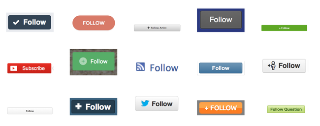
Follow buttons everywhere
It’s fascinating to see patterns appear on the web, and to see how quickly they propagate. You probably remember the clickable-top-left logo (link to the home), the navigation footer with deep links, the tag clouds (these seem to have declined quickly though), or, the most recent #hashtags.
I’m betting big on the the follow button as one of the next most ubiquitous components of many websites in the future.
Everywhere #
Of course, they’re obvious when we talk about the social web. Twitter
is probably one of the early leaders there, closely followed by Tumblr. Facebook came a bit later to that game. There’s also about.me, App.net.
You can also find them on any kind of content publishing application, including Vimeo, Youtube, Instagram, or blogging platforms like Medium and Wordpress.
Obviously, content curation platforms like Pinterest or Storify have them too, and they’re appearing on ecommerce sites, like Etsy now too, or Spotify.
Finally, they’re also coming to a porn site near you. The porn industry has been (and still is!) a big driver for many aspects of the web we use today (micro-payment, ads, embedded media or even privacy). It’s probably safe to assume that a de-facto standard’s not a standard until it’s used on a porn site.
What do they mean? #
Even if the initial use case seemed to be targeted at following people in a unidirectional way (Twitter popularized the idea of following someone who does not necessarily follow you back), you can now also follow any kind of topic, or even objects (mostly virtual). For example, Github, the developer platform will allow you to follow the source code of a given project and be notified when it evolves.
Generally, users express a future interest when they hit a follow button. Rather than performing a query over past data, they express their interest in future, related events.
Following is to the future what searching is to the past.
They have an amazing value for the service who offers them too, because it’s a strong signal to determine what content is expected by its users on their next visit, or what kind of content they’re willing to be notified for.
Decouple! #
As I am convinced content discovery on the web is still very broken, I am extremely interested in seeing these buttons bloom everywhere. However, at this point, they’re also very disappointing in the sense that they are all centric. I can only follow my friends on Twitter if I use Twitter myself. The search analogy still applies here: it’s as if there was no Google but a different search engine on every site we use. Not only does that mean that it’s very limited, but also that we will fail to see patterns and/or use signals which would be obvious on a web scale basis.
If we want to move the follow buttons to the next level and be able to provide meaningful upcoming information to our users, we need to decouple the publication platform and the consuming platform for public information.
Decoupling would also increase engagement on the publishing platforms because it would open their gates to the logged-out users. By putting less friction on the act of following, services could see an increased number of subscriptions, (even remote ones!), while still be able to pull back these users with no account, which they have no way of doing right now.
If you’re interested in using a universal follow button, check SubToMe!
